I’ve always wanted to paint a mural, and when my husband, Matt, and I moved into our new home last September, I finally got the opportunity! I work from home, and this was going to be my first time having a real-life, adult office, so I wanted to make it fun.
First, I had to decide what to paint, which was probably the hardest part of the whole process! I decided on a cycling mural, because the office was also going to be home to our gravel bikes.
I looked on Pinterest and found so many great vintage cycling prints. I didn’t want anything too realistic in style, or too cartoony. I wanted the mural to look like a piece of art that just happened to take up the entire wall.
That’s when I stumbled across the work of illustrator, Eliza Southwood. I love all of her pieces! She actually hand prints her designs on silk screen, which gives them a modern, color-block style.
My favorite was “Dragon Ride,” because of the way the road winds its way through the mountains and provides a sense of movement and perspective. So, I decided to use this piece as my inspiration.
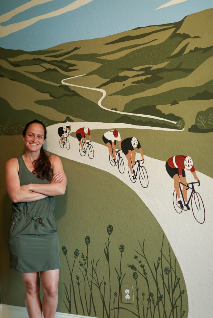
The plan for my office decor was going to be a combination of dark green and rust, so I headed to my local Sherwin Williams to select some colors. The great part about doing this type of graphic mural is that you don’t need many colors, because there’s no shading or highlights.
I needed three different shades of green, a blue for the sky, and black, tan, and rust for the cyclists and the road. Because I wanted the mural to have a cohesive look with the rest of the room, one of the shades of green was the same color I used on the other three walls.
I wanted a high quality paint, for better adhesion, so I bought Sherwin Williams Emerald interior acrylic latex paint. I also made sure the paint was flat, because I didn’t want any shine. Then, I picked up some larger brushes, as well as smaller ones for detail.
Here’s what I used:
- Trylon premium short angle 2 in.
- Trylon premium thin angle 1 in.
- Wooster Pro Nylon/Polyester Firm
- Wooster Shortcut 2 in.
- Assortment of craft brushes for detail
- Roller with thick nap
- Kilz Original Primer
If you want to paint a mural of your own, my number one tip is not to skimp on paintbrushes. There’s such a big difference between a cheap craft brush and a high quality brush, in both texture, feel, and how well it will hold the paint. Spending a few extra bucks on a nice paintbrush makes a world of difference.
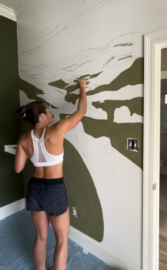
Before I could start painting the mural, I had to apply a few coats of primer to the wall. I used Kilz, which is one of the best primers on the market. If I didn’t take this extra step to prime the wall, the paint wouldn’t adhere as well and I would’ve had to paint multiple coats for it to cover.
Although the wall was already white, it was painted in a horrible semi-gloss sheen, and you can’t paint on top of that, because the paint won’t adhere as well. Looking back I should’ve added an extra step by sanding the wall prior to putting on the primer, but Kilz is so great that a few coats provided a nice surface to paint on.
One of my biggest concerns with painting this mural is that the wall had a knockdown texture, so I was concerned I wouldn’t be able to paint fine details because the surface wasn’t smooth. Ultimately, the primer helped there as well, because it’s so thick it helped to even out the surface of the wall.
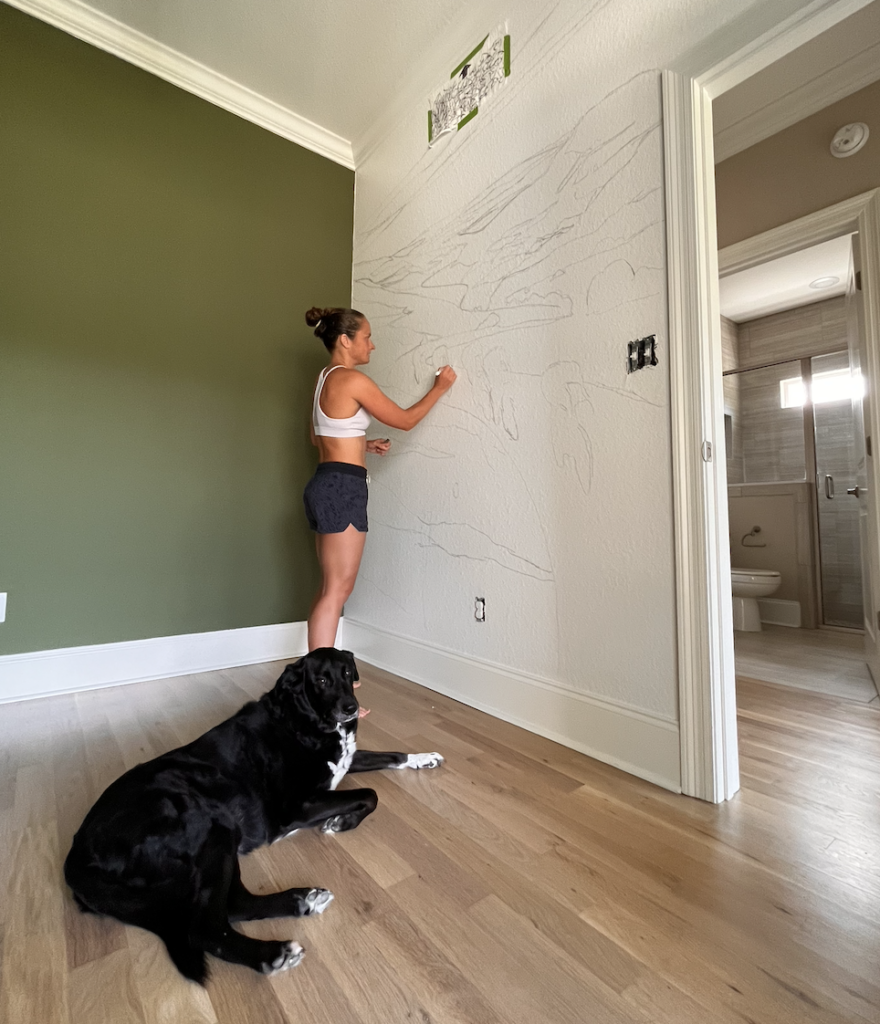
Next, I needed to sketch out the image on the wall, which is challenging when you’re trying to get the size and positioning just right. I used a cool app called Mural Maker by Da Vinci Eye. In addition to the app, you also need a tripod and two iOS devices. I used two cell phones, but you could also use a cell phone and iPad.
I didn’t have a tripod, so I attached one phone to a ladder with a clip. Basically, that device shows you a live stream of the whole canvas. Then, the second device shows you in the frame, standing in front of the wall, with the image you want superimposed on the wall, so you can see exactly where to draw! You can also record while you paint, which is how I made this time-lapse video.
View this post on Instagram
Once I had the basic lines sketched out on the wall, it was time to paint! I started with the largest block of green, which was the lightest shade in the valley and a large part of the mountains. Then, I used one shade darker to add additional mountains. Finally, I used the darkest shade to further define the mountains and add bushes and trees.
Then, I went back in and added some texture details to the valley, as well as branches on the trees. One of the most fun parts was creating the flowers and grass stalks at the bottom of the mural for added interest.
The next part was the cyclists. I wanted them to look complementary in color but have each one be individual. I painted each part by color, so first was the black on the bikes, bib shorts, jerseys, and helmets. Then, to keep everything cohesive, I used the same light tan on jerseys and helmets as I did for the road and clouds. The last step was to add the rust, which was my favorite color!
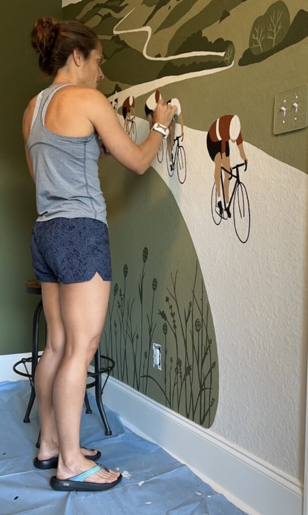
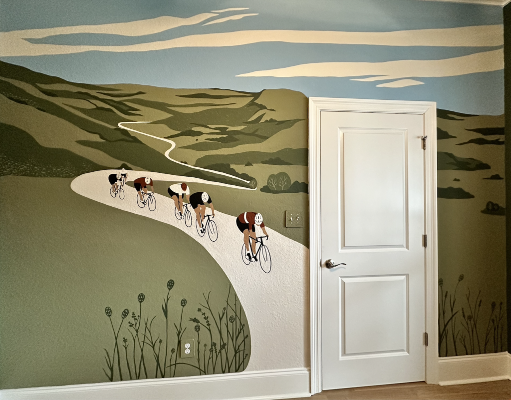
The last step was to paint the blue sky and clouds. Also, I have a door on this wall, so I wanted to extend the mural to both sides of the door, so when you close the door, so can see the entire mural.
Once the mural was complete, I was so happy that it actually turned out as well as it did! But something was missing… I realized that all of the cyclists were men, so I made a last minute decision to add a few ponytails in the bunch.
Something else I did was remove the original light switch plates and pick up some decorative ones at Hobby Lobby. I didn’t want them stand out too much, so I painted them the same color as the mural. It just adds a fun decorative element.
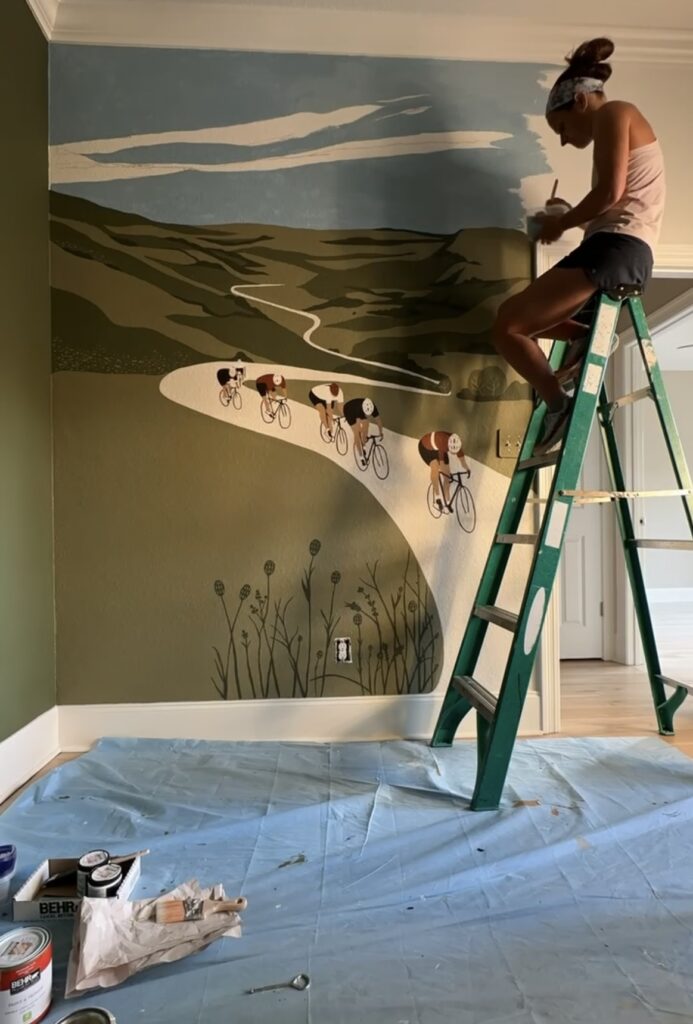
And that’s it! I started the mural on September 17th, and because I was in the middle of training for Ironman Florida (and I have a full-time job) I was only able to paint for a few hours every couple of days, with some longer stretches on the weekend. It was actually a great taper week activity. I’d grab a kombucha, put on relaxing music, and work on the mural.
There’s just one thing I wish I’d done differently. Because the walls have texture, and I was going to be painting a feature wall with a mural, that meant I needed to paint a very straight line at the intersection of the walls. That was very hard to do, even using tape, because it doesn’t stick very well to the wall’s texture, so you don’t get a clean line. So I had to go back in after the fact with a small paint brush and clean up the edge a bit.
After talking with the gentleman who was painting our kitchen cabinets, he gave me a great tip. He said to run a small bead of caulk from the ceiling to the floor, right where the walls meet. Then, take your finger and smooth it out to remove the excess. That provides you with a smoother surface to paint a straight line!
Overall, I’m really happy with how the mural turned out, and the colors look so great with the rest of my office decor. I guess I will have to do a home office reveal sometime soon…
Check out this time-lapse of the project!
View this post on Instagram
